Come Tuesday, after Holocaust Rememberance Day 2014 is over, New York’s Jewish Museum is expected to unveil a new logo. The new hexogram based logo will replace the red boxed “The Jewish Museum” image that graced its marketing materials, ads, and bags.
The new design is the work of Stefan Sagmeister of Sagmeister & Walsh (You probably remember his 1993 nude postcard that announced the formation of his design firm). The Director of the museum, Claudia Gould, said “The old identity didn’t work anymore – it wasn’t adaptable.”
Perhaps, just as Kentucky Fried Chicken is KFC (playing down the chicken); Pizza Hut toyed with The Hut; General Electric is “GE,” and Radio Shack is a Shack; the museum’s logo will highlight its “JM” initials.
Old Logo
Sagmeister, an Austrian born graphic designer, received a Grammy Award for his design work for musicians. He is a graduate of the University of Applied Arts Vienna and Brooklyn’s Pratt Institute. He said that the Jewish Museum’s new logo may be based on a sliver of historic imagery (the hexagram shape), and a contemporary look. He senses that the new look is necessary to attract a younger audience. His motto is “Design that needed guts from the creator and still carries the ghost of these guts in the final execution.” (I have no idea what this means)
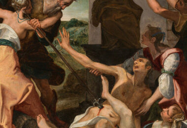
Part of the New Logo
The Jewish Museum is located in a multi-story mansion on Manhattan’s Upper East Side; the former home of the Schiff/Warburg family. It is the preeminent museum in the United States devoted to art and Jewish culture; and it maintains a collection of 26,000 objects that is among the three largest of its kind in the world. Under new leadership, the museum’s goal is to expand its reach to a more diverse audience through expansive interdisciplinary programming, education, and contemporary exhibitions.
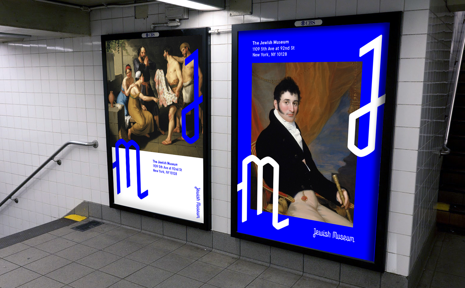
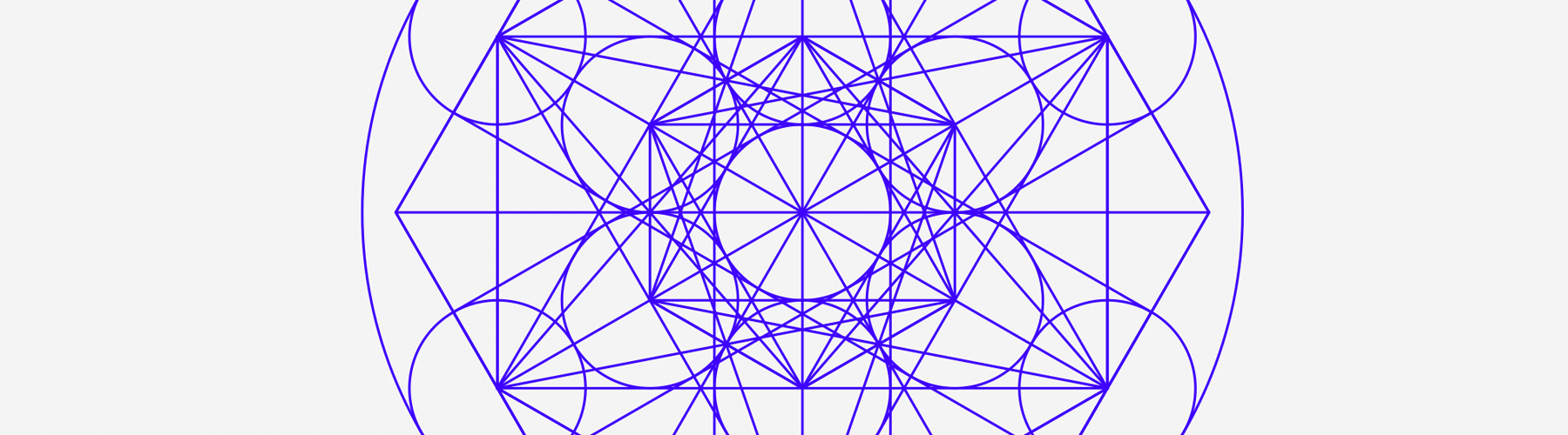
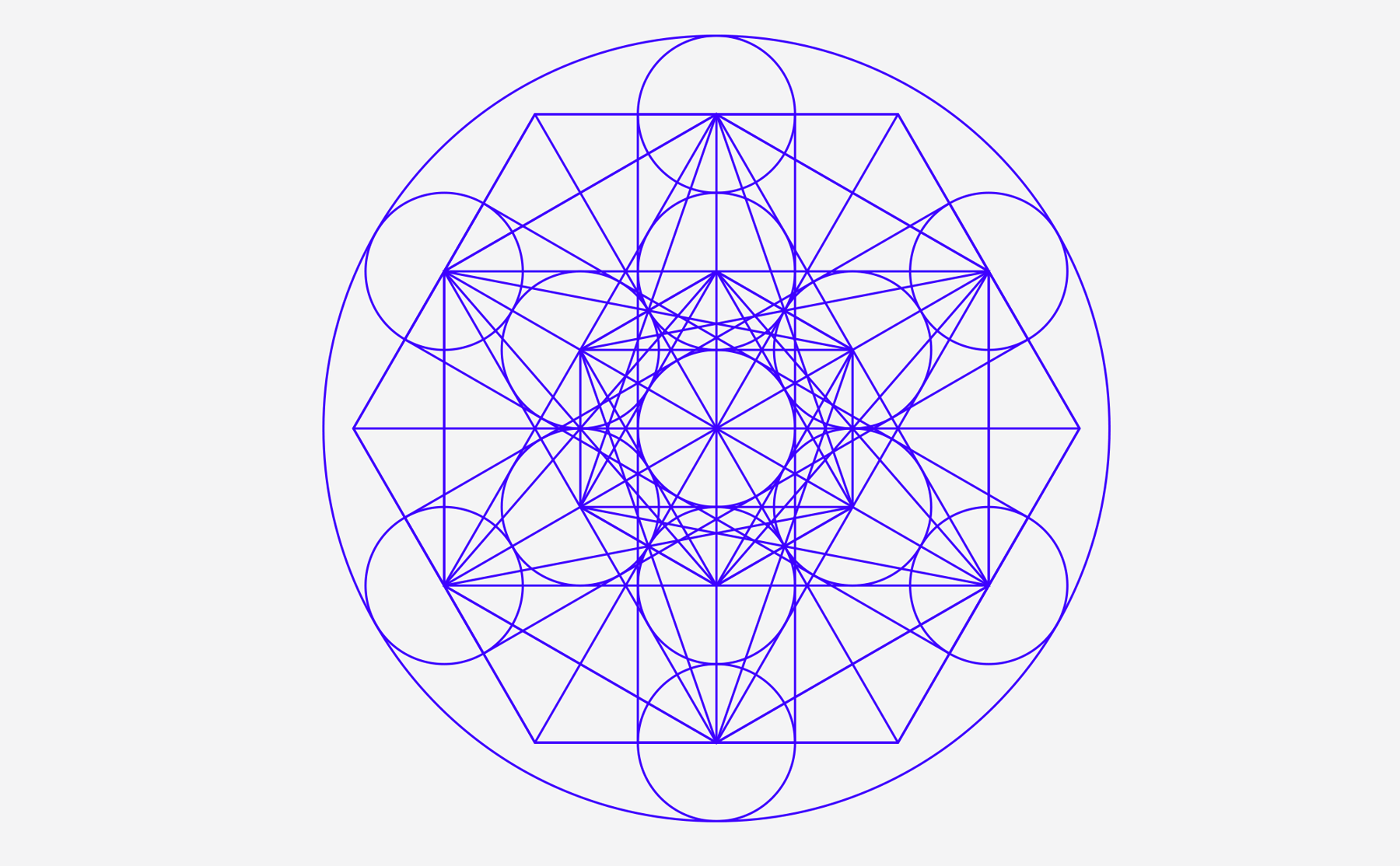
The goal in rebranding the museum was to connect the historic and contemporary, and engage multiple visitor generations. The new identity system is founded on “sacred geometry,” an ancient geometric system from which the Star of David was formed. The entire branding system is drawn on this grid, from the word and logo mark, to dozens of patterns, icons, typography, and illustrations.
Example of JM logo in center on online screens
IN OTHER M– USEUM NEWS San Francisco’s Contemporary Jewish Museum named Renny Pritikin as its new chief curator. He was the co-director of New Langton Arts in San Francisco, chief curator at the Yerba Buena Center for the Arts, and, director of the Nelson Gallery and Fine Arts Collection at the University of California. Lori Starr, the CJM’s executive director said, “Renny is, quite simply, the ideal candidate, and I am thrilled that he joins us now to oversee a new phase of exhibition and program innovation… His proven track record for imaginative, boundary-crossing, community-engaging content says it all. How proud are we to welcome him to The CJM family.”
The contemporary J and the M on sample subway posters to mesmerize younger audiences

 Come Tuesday, after Holocaust Rememberance Day 2014 is over, New York’s Jewish Museum is expected to unveil a new logo. The new hexogram based logo will replace the red boxed “The Jewish Museum” image that graced its marketing materials, ads, and bags.
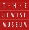

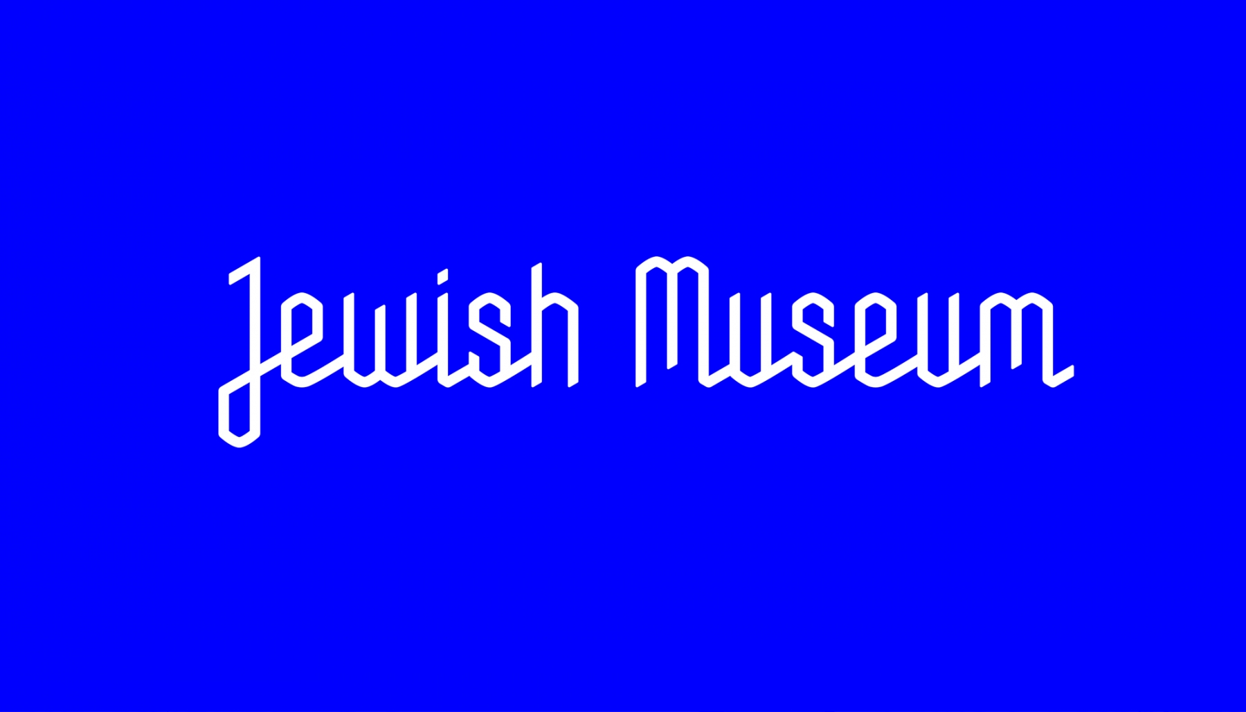 The goal in rebranding the museum was to connect the historic and contemporary, and engage multiple visitor generations. The new identity system is founded on “sacred geometry,” an ancient geometric system from which the Star of David was formed. The entire branding system is drawn on this grid, from the word and logo mark, to dozens of patterns, icons, typography, and illustrations.